If there is any clear trend among high school print publications in Colorado (and across the nation), it’s towards more of “magazine” philosophy and away from our older “newspaper” models. Sometimes this is easy to see, as the size of the publication goes to “letter-sized,” rather than the long and short tabs of the past.
But even most 11×17 tabloids publish monthly or less often, so the magazine approach to coverage is to include more depth, more analysis, more personality, and less traditional news.
News, including most sports events, has moved to social media and websites.
Has this been a smooth transition? Not exactly. Many staffs are reluctant to completely abandon newspaper sections, for instance, and most staffs end up going with either one-page of coverage or a spread of coverage, even if readers might benefit from more depth (or way less depth!). It is the rare printed publication that will present a four-page article. But it is all too common to find student magazines continuing to publish the 8-inch story (one way to think of those stories is that they are, by definition, either too long or too short).
Perhaps this will be the year that more staffs will fully commit to the reality that they are working on a magazine (even if printed on newsprint, and even if their classes still include “newspaper” in the course title).
There’s a lot to this idea of fully committing to being a magazine, but one way to make some progress is to study what successful professional magazines are doing, and then steal (of course, we really mean ADAPT) the most appealing ideas for our own publications.
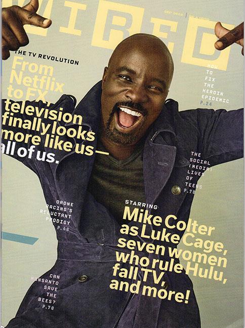
You could do worse than to study “Wired” magazine, and looking at several monthly issues gives you a better set of resources than just a single issue. But what if you had JUST the September, 2016 issue? What could we make use of, right away?
Magazines mix quick reads with longer text, and rarely publish an 8-inch story
“Chartgeist” is a regular feature of the magazine, mashing up the idea of “zeitgeist” and news, and presenting three distinct bar graphs that both entertain and inform. They START a conversation among readers.
Let’s deconstruct the September chart. The reporter first must do a lot of reading and viewing to come up with three issues that seem timely and significant. Here he chose “tech-related injuries,” iPhone 7 features (anticipating the newest release), and “what’s scaring us?” (perhaps after observing the presidential campaign). NOTE: the current CSMA coverage challenge “FEARless” grows out of this question.
It’s quite a tight formula that he is working with: four responses are allowed in each area, with about five words max to define each response. Each bar graph needs an x-y axis definition, while the actual length of each bar is clearly meant to have meaning only in relation to the rest of each bar graph, and also clearly reflects an opinion (though the reporter could likely defend the choices).
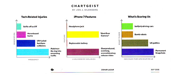
BTW: bar graphs are best used to answer questions of quantity, as opposed to percentage (pie graphs are best there), or change over time (line graphs or fever charts are best for displaying change).
Shouldn’t our next issue feature one or more charts that help focus our readers on the zeitgeist (the social spirit) of our school community?
A great charticle can provide an anchor for a longer piece of text
A charticle (a cross between a chart and an article) is designed to present small chunks of information to readers who either need a quick summary of a longer, more complex argument, or need something to quickly understand an issue, since they are not willing to plow through longer text. We have both of those types of readers in our schools.
The charticle below accompanied a four-spread article titled “Like, Flirt, Ghost,” by Mary H.K. Choi. You can find the entire article here, and it’s worth a read. The reporter spent some time interviewing and just hanging out with five teens, digging into how they use social media.
It’s worth a few minutes of class time to discuss the phenomenon of reporters long past high school age doing the reporting on what high is like now. Do reporters need some distance from the actual experience of high school to really provide insights (or maybe they need time to recover?), or do reporters need to acquire some additional life experience in order to make sense of the chaos of high school?
Should actual high school reporters take a stab at making sense of the world they are living in? Or are high school students too busy actually DOING high school to take stock, to analyze, to even criticize, what is going on all around them? BTW: the answer that student media MUST give is that we CAN provide insights and facts and narratives about what it’s like to be a high school student today. Otherwise, aren’t we just pretending to be journalists?
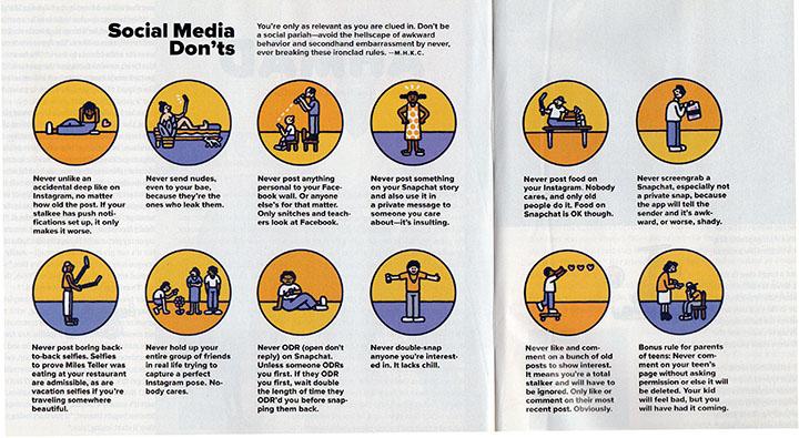
Note the consistent color palette used, and the art is quirky and not at all photorealistic. Twelve quick pieces of social media advice, with tightly written descriptions, all beginning with “never…”
A packaging idea worth stealing right now
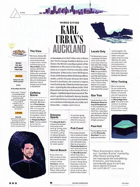
This final example from the September issue of “Wired” is essentially a one-page travel column, and we could use the concepts for our own “quick looks” at communities in our area. It is also, interestingly, an evolutionary step forward in one of the most common alternatives to text: the Q&A.
But we could also use the concept for covering clubs and organizations, or even sports teams or individual classes.
The page uses a six-column grid, which means most legs of text are so narrow that you really need to go with ragged right text.
A clear introduction, set two grids wide and justified, anchors the page and provides an introduction to the assorted chunks of information on the page. Quick subheads lead to single grafs of information, with a nice use of boldface to emphasize particular names/places. If you look closely you see that all the “text” boxes are actually quotes from Karl Urban, the expert source.
The art is quirky and avoids rigid rectangles, and the pull quote is gray, rather than black, and several points up in size. You may or may not like the hairline strokes that keep everything organized. Those strokes are part of the Wired graphic identity.
In terms of reporting, the concept to steal is choosing one person who knows the club well, or who has an interesting take on the club’s activities.
