

This month’s recap focuses on two dynamic magazines: Entertainment Weekly and Wired.
Grids
Want to shake up your look a bit? Worried about how to include more content in a smaller space (magazine size, or letter-size)? Part of the answer may lie in using a clever vertical grid.
Professional designers feel constricted by the basic 3- or 4- or 5-column grids. Options are limited and layouts can become repetitive quickly.
 One flexible grid strategy lies behind a couple sample Wired magazine pages. The first is from a multi-page article and uses 12 columns to provide framing, added white space, and text “leg” practicality.
You can see the narrowest column to the left of the page, and this provides framing white space for an otherwise text-dominated page.
The dropped column (between legs 2 and 3 of the text) provides some white space (visual relief) while also allowing a liftout quote some space and hosting the extended byline of the author. The dropped column is two grids wide.
Each leg of text is three grids wide, and those 9 picas allow just enough space to “justify” the text legs. Justifying the text gives the page some solidity and emphasizes the vertical legs. There is danger in justifying narrow legs of text, as the computer may struggle to create letter spacing and word spacing that is not awkward. In fact, the wrong balance of point size and line width can produce “rivers” of white space running through the legs of text, which is distracting to the reader.
If you note rivers of white space in a text leg, the standard solution is to choose ragged right over justified.
One thing the designer has done to add to readibility here is to add a little bit of extra leading between lines of text. It might only be a point of two, but that extra space adds up.
Just in case: a pica is about one-sixth of an inch, and a point is 1/72 of an inch. These are printer’s measurements that have been used for centuries. One relationship between them is that there are 12 points in a pica. We also use points in measuring type size. A 72-point headline is about one inch tall. A 36-point headline is half an inch tall.
A second page from Wired demonstrates a much simpler use of the 12-column vertical grid. Here the designer wanted to make sure the images were large enough to be appreciated, and making each four grids wide provided the balance between content for the page and that visibility.
At a glance, the page looks like a 3-column grid. The “trick” in using a grid is always knowing that a 6-column grid lies behind a 3, and a 12-column lies behind both of those. Professionals begin with the most flexible grid as they construct pages.
The good news is that we can always opt for the “simpler” grid structure if we need that.
Typography
The most important and most common design decisions we make involve typography. Those amazing visuals catch the readers’ eyes, of course, and great pages usually feature some sort of dominant art, but professional and pragmatic typography ties the entire publication or website together.
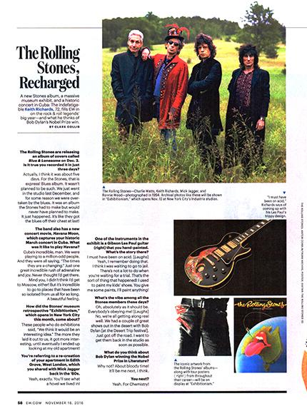
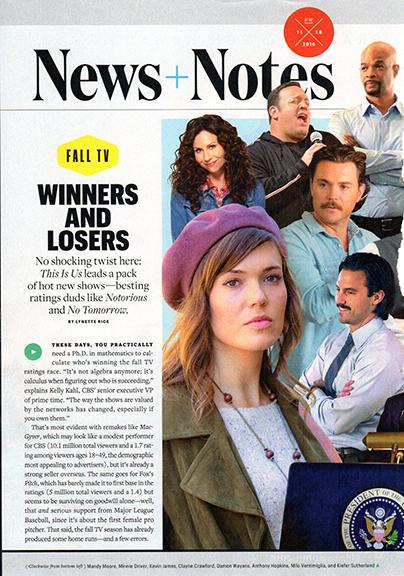 A recent issue of Entertainment Weekly provides us with some strong typography strategies. This “News + Notes” first page features a combination of all-cap main headline, set in a bold sans serif font, and a lighter serif face for the subhead.
Together, they provide readers with a headline package.
Note the tight leading between the all-cap sans serif “WINNERS AND LOSERS.” InDesign comes with a default leading of about 20 percent of whatever point size you are using being added between lines of type. That space becomes particularly excessive as the point size of the type gets larger and larger.
We also need to pay attention to the fact that when we choose to set type in all-caps, we have no “descenders” – no tails for lower case letters like g or p – though the computer retains the space for those descenders, even if a line of type doesn’t contain them. Bottom line: we need to go in and manually reduce the leading in these cases. Here, we might have 36 point type, with 24 points of leading. This would be unreadable if we were setting words with upper case AND lower case letters, but is perfect for this sort of headline display.
A last thought: we can create contrast on the page through skillful combination of sans serif and serif type. Sans serif has more “body,” more “oomph.” Serif has more personality, more variety. Together though…
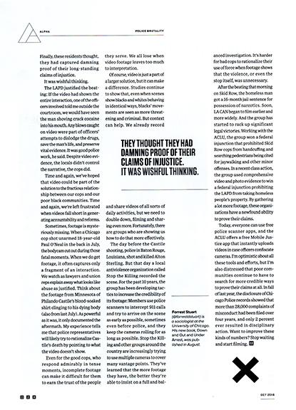
A second Entertainment Weekly sample is full of interesting type choices (not to mention the clever use of the grid to create separation between two unrelated coverage packages). The first thing to note is that all the type of the page is sans serif, with the “color” produced by mixing boldface with Roman.
The white text is called “reversed” and worked well on the higher quality paper EW uses. On newsprint, the subtle spreading of the ink on the porous paper might make the type hard to read. If you are printing on newsprint, the usual strategy to fight this “dot gain” is to bump up the point size a bit. Instead of 8-point, go with 9- or 10-point.
The Q&A with Kim Gordon is anchored by the limitation of three questions. The large numbers provide focus, but also inject some added white space. Even the most reluctant reader might find the time to scan through three small bits of information. The trick is to edit tightly, so that all answers are in one short paragraph each.
A third page from the same EW issue demonstrates how to make use of running type ragged LEFT, which can cause problems for readers when not done properly. Legs of text set flush right can really highlight the dropped columns of the grid, of course, and certainly provide a change from what readers expect. But flush right text can’t really support paragraph indents (there are so MANY indents that they get lost). The solution? In this Q&A, the designer/editor makes sure each question and each answer is a single graf.
The boldface/Roman sans serif adds color to the page and makes it easy for readers to follow along. BTW, this was page 58, or a left hand page of a spread. We don’t advocate for ragged left as a standard structure for your publication, but when you DO use it, it makes sense to do so on left sides of spreads, bringing readers’ eyes to the center.
A final note: the headline is set in a boldface serif font, which is a nice change up from the normal practice of headlines in sans serif, text in serif. It’s all about visual contrast, and we all have the same typographic tools the professionals at EW or Wired have. We may not have the stable of professional illustrators and photographers, but our type can be just as sharp, just as professional, and just as eye-catching.
Our advice? Look through magazines and newspapers, grabbing samples of your favorite typography. Then copy the styles and techniques, with your own content. That’s not stealing… that’s being smart!